Color Grading
Scenarios
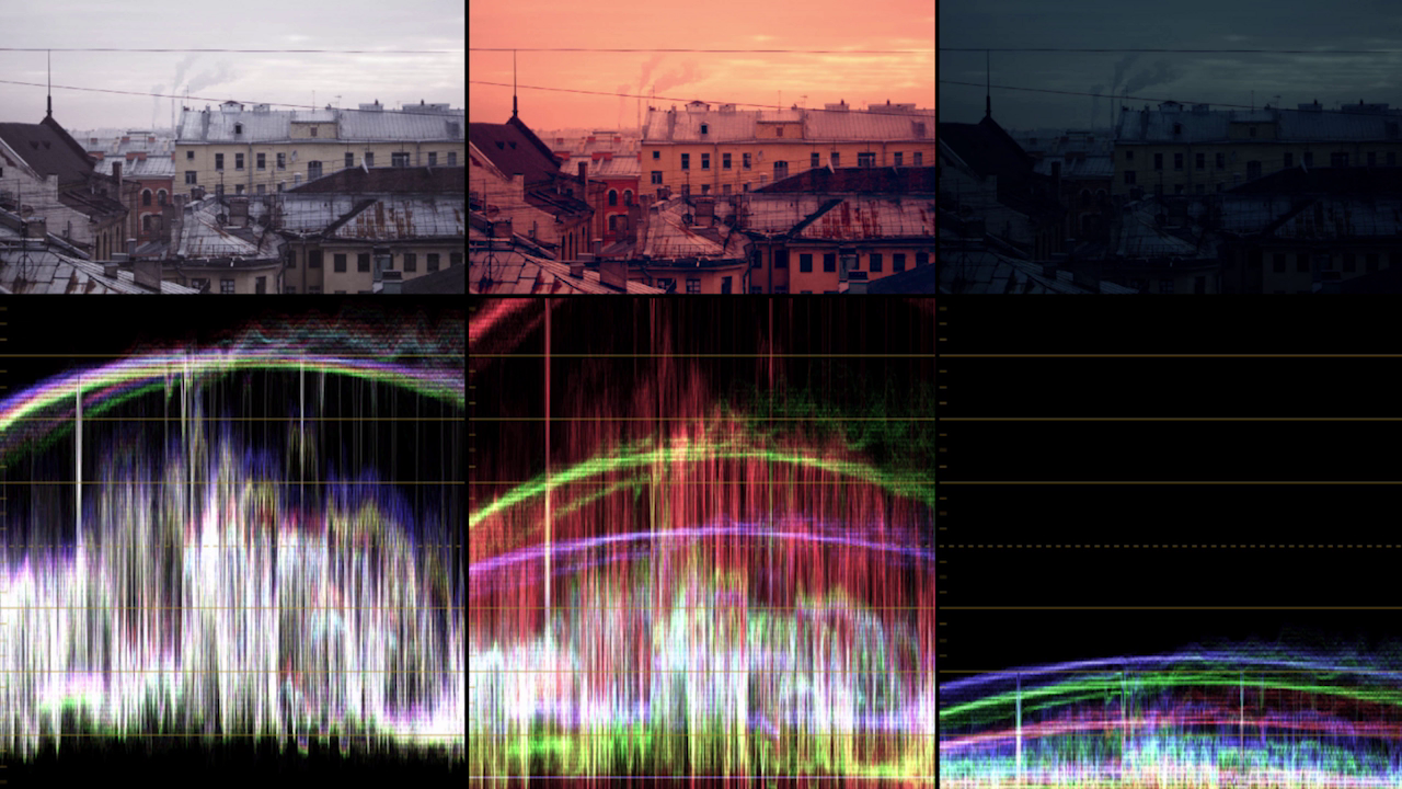
Свет в городском пейзаже
- Закат - много красного, оранжевого в средних и в светлых тонах, синий цвет в тенях противопоставляется;
- Рассвет - более холодный чем закат, больше зелёного чем красного/оранжевого;
- Ночь - в кино обычно синяя ночь, чем чёрная. Небо сохраняет светлость;
- Унылый серый город - снизить насыщенность (Saturation), чтобы это подчеркнуть.
Цвет в портрете
Хакрактер рисуется контрастом. Обычно грейдинг начинается с опусканием вниз теней. Дальше отделение от фона.
Работа с ЧБ портретом
Человек не воспринимает ЧБ как именно ЧБ, он ищет и выдумывает немного цвета. Поэтому ЧБ не делают полностью лишённым цвета, его чуть-чуть подкрашивают для придания настроения: для тёплого настроения подкрашивают в коричневый, для “глянцево-журнального” настроения - в синий. Количество подкраса совсем маленькое, совсем чуть-чуть, как петрушка в супе.
Teal & Orange
Start by grading the image into nice blue using all color wheels (Lift, Gamma, Gain), and distribute the wheels in a clockwise fashion between each other!
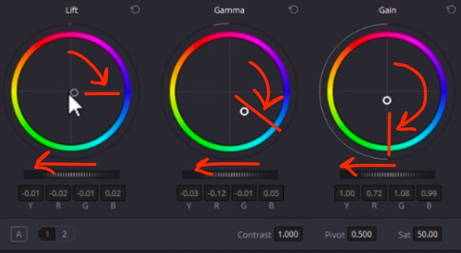
All colors in the image turn blue, but shadows have to stay neutral: user the Log wheels to fine tune: Shadow, Midtone, Highlight wheels between Low Range (default lower than 33% = shadows) and High Range (default higher than 66% = highlights). Turn the Shadow wheel to blue counterpart to make shadows neutral. Lower the Low Range (around 10%) so that midtones are not affected;
THEN mask out skin and other “warm elements” in the picture (in parallel node) and grade them into the opposite color - yellow-orange;
Use the Log wheels to balance the colors: make a soft bridge between warm skin and cold background by turning Shadow wheel to green a bit, Highlight to magenta;
Balance the footage colors, so the color work together, and not appear as isolated elements: one cheater method to do this is to radically darken the background. Since with teal&orange we get the maximum color contrast, it is better to make the light contrast stronger as well. Another method is to make subtle changes - bring the overcolored ares back by lowering saturation, for example.
Color Wheels → Color Boost (number in the below section) - increases/decreases the saturation of the MOST SATURATED colors in the image. Helps if you have some over-saturated colors which you want to level down, without touching the rest if the image.
Add Saturation to high values, then subtract Color Boost to remove color spills.
Example: vegetables in a white glass bowl will pass their color to the bowl. To keep it white, subtract Color Boost.
Цветокоррекция и покрас плёночного кино
В плёночном кино грейдинг являлся этапом PRE-Production. Это связано с необходимостью подбора правильной плёнки, дающей нужную гамму цветов. Для проявки плёнки проявочные машины (пример - российская машина МПМ—16—3М), которые работали по заданному СТАНДАРТУ.